eLocal Brand
Design / Code / Illustration
Project Details
About the Project
When I was hired, eLocal had no brand guidelines to speak of. So I made it my mission to translate a five-year backlog of inconsistent design work into a simple and flexible set of visual elements, and encapsulate my work into a living style guide. As a part of the process, I also gave the company logo a much-needed refresh to match the new branding.
The Logo
eLocal’s owners liked their old logo, so I had to convince them to let me rework it. But I knew it would be worth it: the level of detail made the logo looked outdated, and the odd shape was difficult to use in nearly every application. I thought through a lot of designs centering on the “local” concept (some of which I was sad to let go).
Logo Exploration

But in the end, the owners liked the simplest version:
The Old Logo
The New Logo

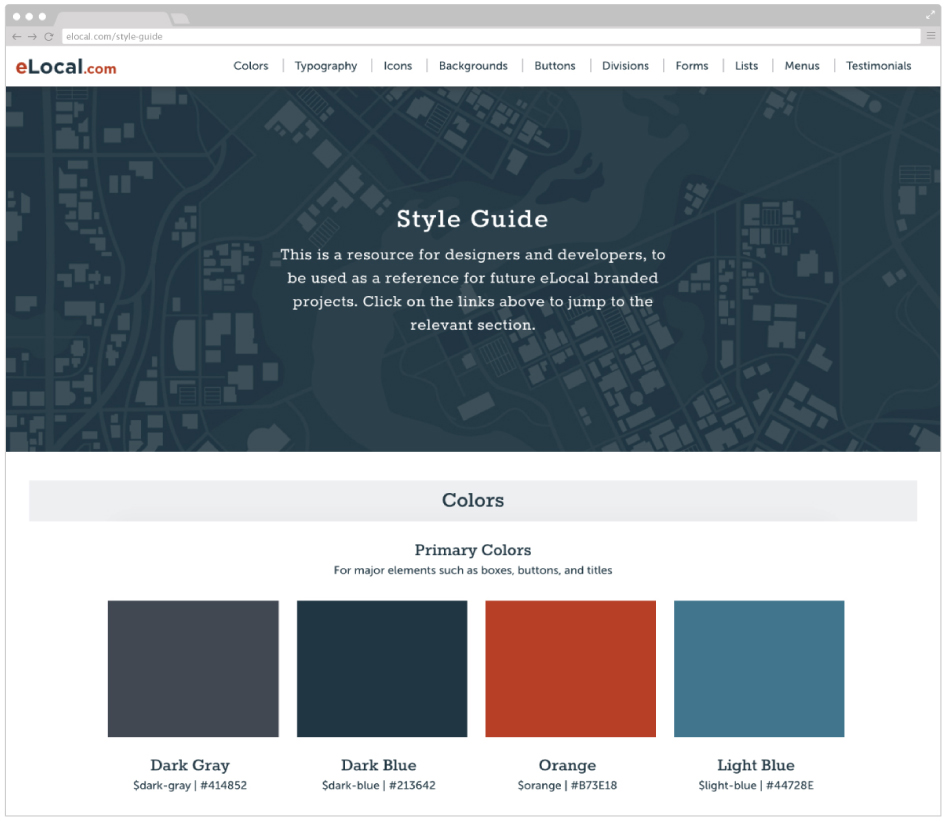
The Style Guide
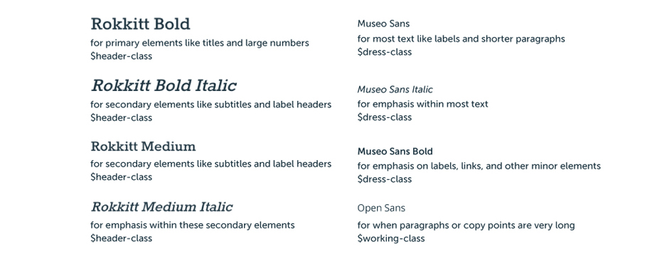
The style guide was meant to define the rules of our CSS class-naming structure as well as our visual design, so I added annotations within each section that referenced corresponding CSS selectors.
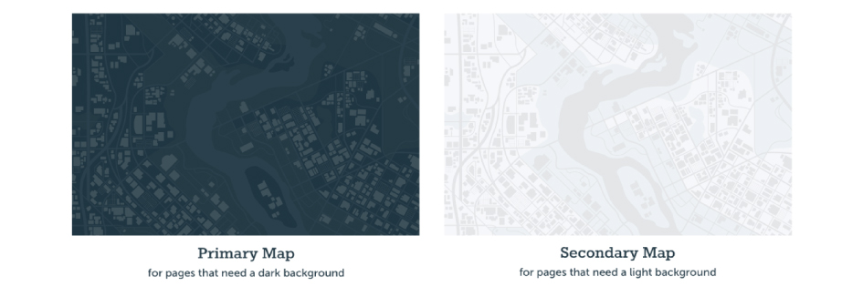
I designed this map illustration to be a vertical tile, so it could be used as a seamless background for any length of page.
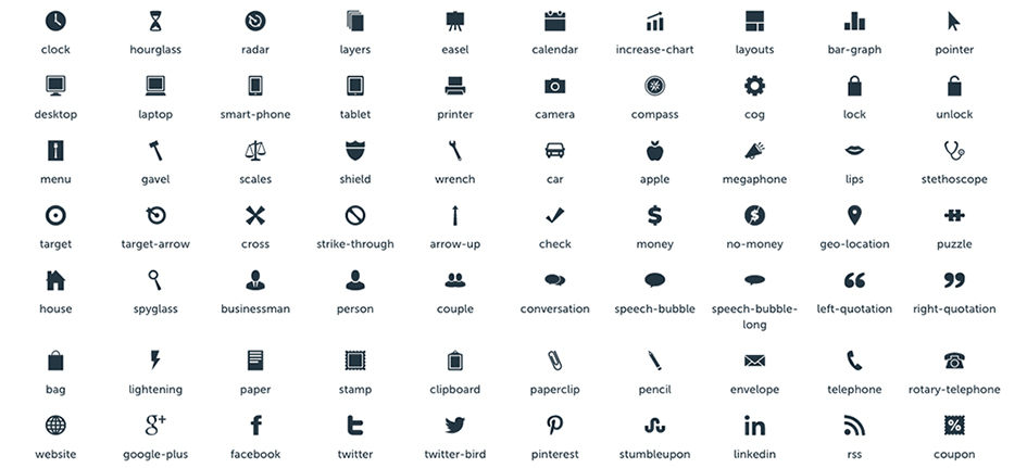
I created a set of custom icons to blend seamlessly with and use alongside Font Awesome icons.
Small details like the custom chunky, bright blue checkmarks on eLocal’s forms elevated the look of the website, and also improved readability.

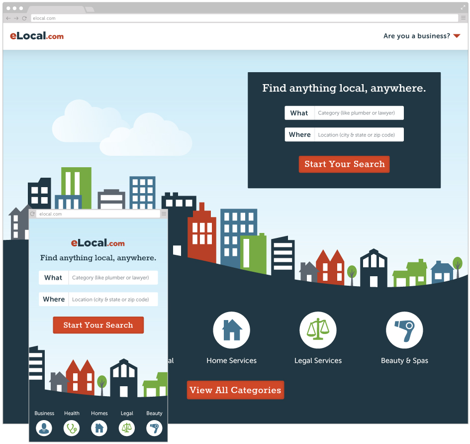
The style guide and new logo in use on a proposed homepage refresh:
See the entire style guide here.